It’s Time for Another Charity Auction
It is officially the season of gift-giving and goodwill toward your fellow humans, which means it’s also time for my next charity auction. Oh, and it’s also the season of eating great food with people you love, which is also what this auction is about.
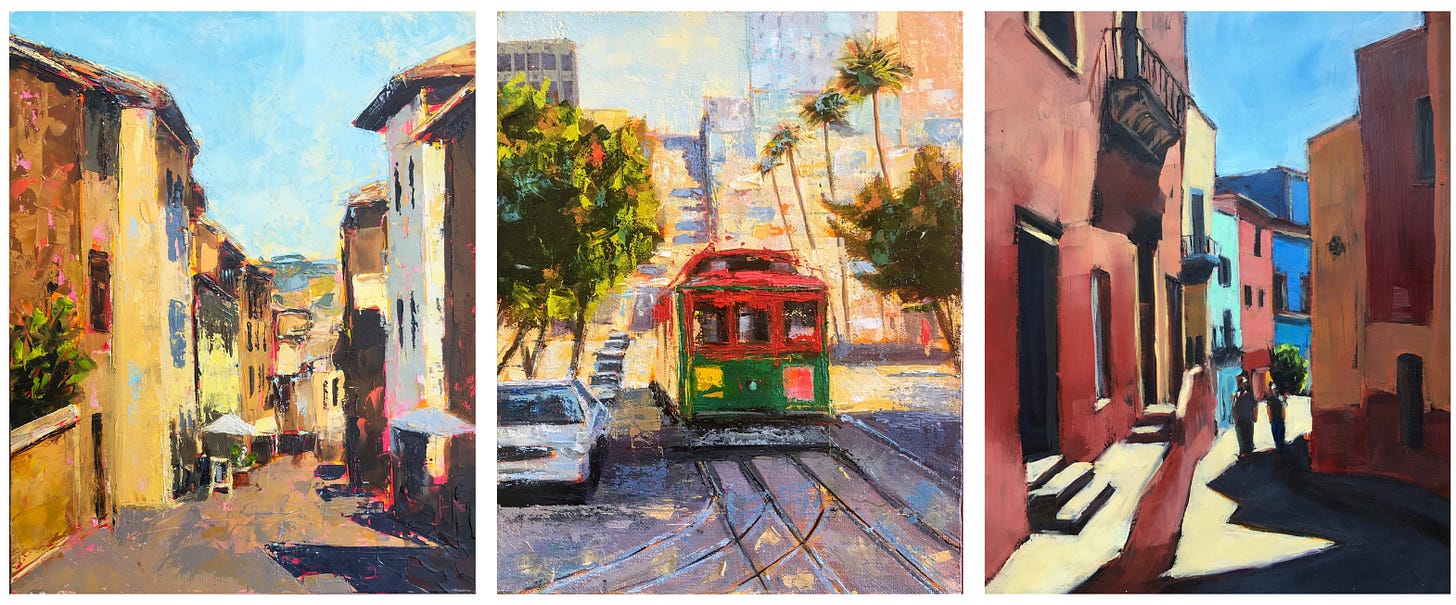
Twenty-four small oil paintings are live on eBay now, with bids starting at only ten bucks. Ten bucks! Get in early on this deal!
100% of your purchase price goes to World Central Kitchen, the charity founded by chef José Andrés to feed people in Haiti after the devastating earthquake in 2010. Since then, WCK’s global network of chefs, restaurant owners, farmers, and volunteers have fed people around the world in times of crisis. Lately, they’ve been in war-torn Ukraine and in Pakistan, where a third of the nation was flooded.
World Central Kitchen is a highly-rated, award-winning charity, and all funds are donated directly through eBay’s charity program when the auction concludes.
And of course, you get a little painting of mine out of the deal, which I will very happily pack up and send to you! Paintings make great gifts!
Some of these are paintings that I’ve held onto for a while, because I was so pleased with how they turned out and I wasn’t exactly sure I’d ever be able to replicate whatever I did with the brush and the palette knife. That happens sometimes—one painting or drawing is so much better than the rest that you just want to keep it and study it and wonder how you ever did it. Eventually, though, the rest of your work catches up and it’s okay to let those exceptional paintings go.
Anyway, please go take a look at all the paintings, and bid on something to support World Central Kitchen, and tell your friends to do the same!
What exactly is a visual journal?
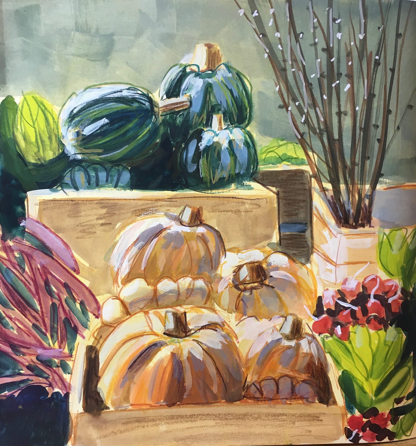
I had this idea to make a visual diary: a diary not of my thoughts, or of the events of the day, but a diary of what I saw. What I looked at. A diary for my eyeballs.
It took me about a year to fill this sketchbook up, in part because I was also busy filling up other sketchbooks with other drawings and paintings that were all, arguably, records of what I saw. What’s the difference between a visual diary and any other sketchbook?
Maybe there isn’t one. In this case, I tried to be deliberate about what I chose to paint. I wanted every painting to say, “this is what I see as I go about my day. This is what the world looks like through my eyeballs.”
But in fact, I cheated a bit: a few of the paintings are friends’ vacation photos. It was the middle of winter and I could not stand to paint any more snow and fog and rain, so instead I’d paint what my friends’ eyeballs saw in Baja California or wherever they happened to be. And then my eyeballs saw those photos on Facebook, and they went into my visual diary.
And of course, I left a lot of things out. I was near the end of this book before it occurred to me do a painting of my bedroom, a place I spend a solid third of my life. I never did do a painting of the computer I’m sitting at now, or the pile of shoes by the front door, or the coffee maker.
So I think I’ll start another one, and this time I’ll be even more deliberate about framing every image in terms of what my eyeballs really see as I go about my day.
These are all either gouache or acrylic ink paintings, done in a Stillman & Birn 8x8 inch Zeta sketchbook. Zeta refers to the type of paper—this is a sturdy smooth paper that can take some wet media but not too much. It’s fine for gouache, which dries quickly and allows for many layers to build up, and it’s great for acrylic ink, which sort of coats the paper as you go anyway. Since acrylic is basically plastic, every layer you put on becomes a kind of solid coating to which more layers can be added.
Anyway, I hope you like the visual diary. Maybe this will inspire you to keep one of your own. Wouldn’t you kind of love to look through your friends’ & family’s visual diaries, and just spend a little time seeing the world through their eyes? Feel free to talk about it in the comments (link at the bottom) or, if you have the Substack app, in the chat (read more about that below, too.)
I had a very long conversation about art and writing and someone drew a picture of the inside of my brain.
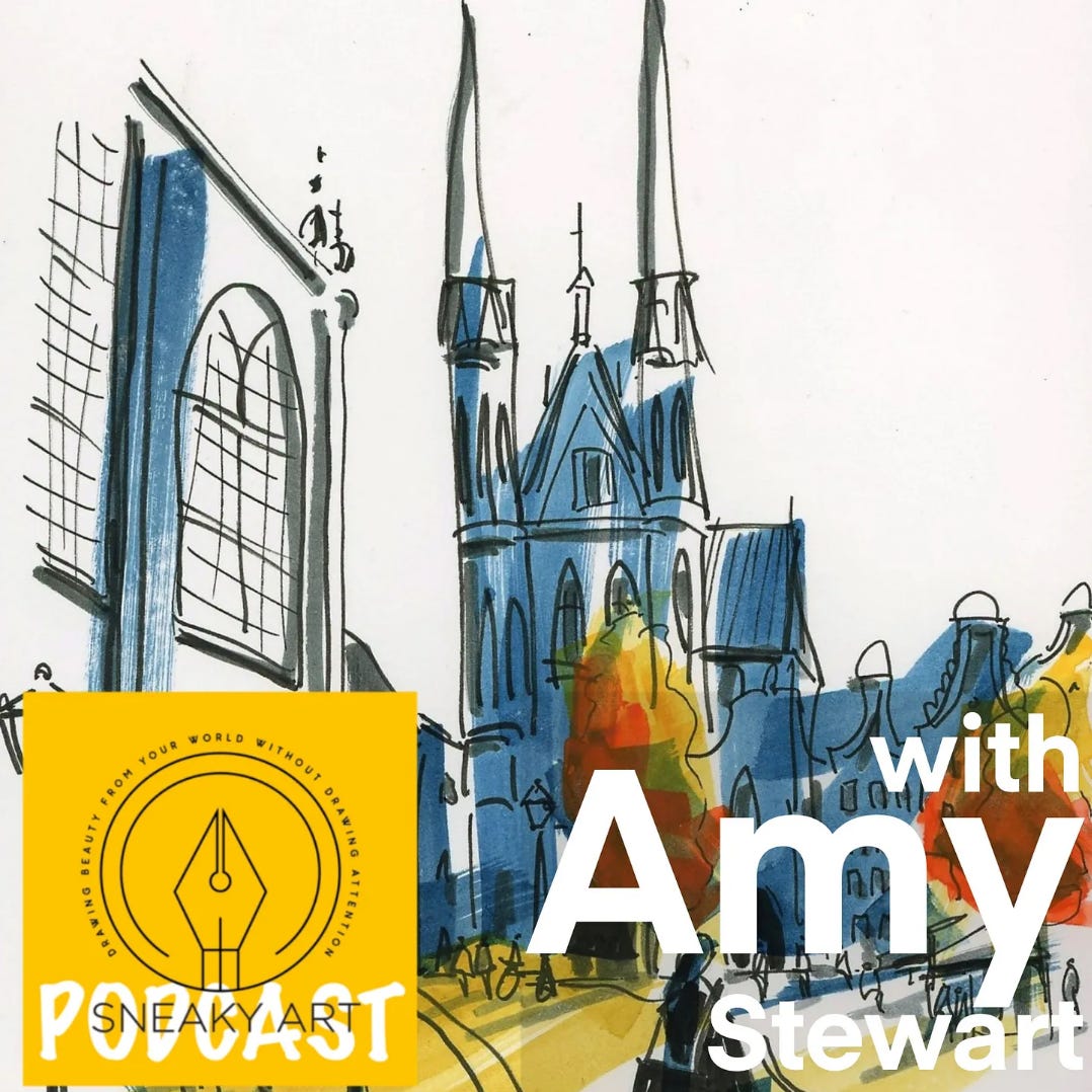
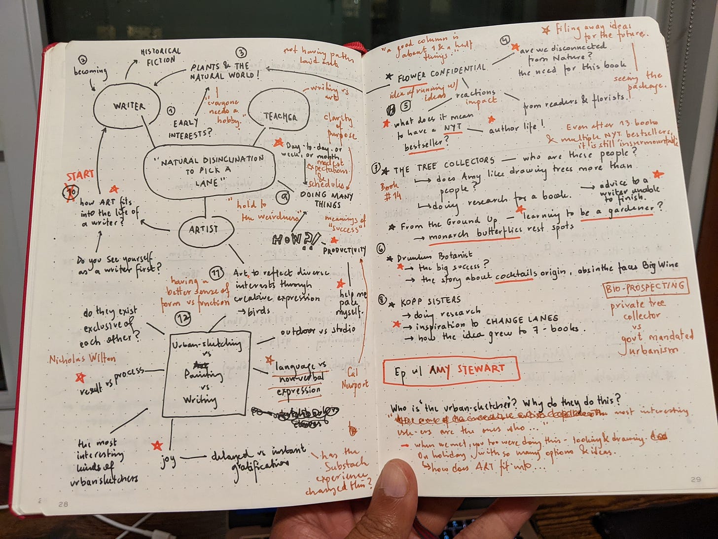
After I met up with Nishant Jain in Amsterdam in August, he invited me onto his Sneaky Art Podcast. He’s done in-depth, long-form interviews with many of my favorite artists, and I’ve enjoyed every one, but I did not think I was podcast-worthy. Anyway, we had a wonderful long, rambling conversation that you might listen to over several walks, if you’re the kind of person who takes walks and listens to podcasts. Read all about it here. You can find Sneaky Art everywhere you get your podcasts, and I’m on episode 53.
I was very taken with the notes he made before and during our conversation, below. I have to say, I think this actually is kind of what the inside of my head looks like, except there’s nothing here about whether it would be OK for me to go get a cookie at around 3:00 in the afternoon, nor is there any mention of what sort of exercise I ought to be doing to fix that annoying pain in that one joint that until recently functioned so well that I never even knew it was there.
I made a new art class, and there’s a prize in it for you!
Hey guess what! I have a new art class for you! You can take this class on Skillshare or Udemy (get the links here), but if you take it on Skillshare, I’m doing a giveaway. For a chance to win one of the sketches I made as demos for the class, just go over there and do these things by November 30:
Take the class
Post a project
Post a review
Be sure you’re following me as a teacher on Skillshare
I’ll hold a random drawing & notify you through Skillshare if you won. Also, it would just mean a lot to me if you took the class and got something out of it. If you have any questions about this or any of the classes I teach, feel free to post a comment here. I’m always happy to hear from you.
There’s a whole other pasta sauce I never knew existed
This is not a cooking newsletter, and I am not a good cook, but the fact is that we all have to figure out what to eat three times a day. Occasionally I make a discovery worth sharing. This one has to do with the most mundane default dinner option of all: pasta.
You do not need a recipe to make this. It’s more of a concept.
First, roast some squash. It doesn’t matter what kind. Pumpkin, delicata, butternut, whatever. Go ahead and throw in some whole garlic cloves, and maybe an onion chopped into quarters, and let it all roast together. This is something you could do earlier in the day if you think of it.
Scoop out the roasted squash, along with the onions and garlic, into a blender. Make a puree. Pour in a bit of milk or cream or broth so it’s more liquid and sauce-like. Add some spices (salt? pepper? cumin? paprika? nutmeg?)
Cook your pasta, drain it, and combine it in a pan with this sauce you just made. Maybe add a little pasta water. Stir in as much butter and parmesan as your conscience will allow. Top with some herbs—parsley? sage? thyme?
That’s it! That’s the whole thing. It’s really surprisingly good, feels vaguely healthy, and I can’t believe I only just now found out about it, after this many decades on the planet.
I thought I knew all the pasta sauces. I did not. There are still some surprises in this life.
My new favorite art tool is a Magic Eraser
I’m illustrating my next book (you can read more about that here) which means that for the first time, the pictures I draw have to meet some sort of quality standard. I can’t just do any old grubby thing in a sketchbook. These illustrations need to be carefully executed, on nice paper, properly scanned and organized, and delivered to the very impressive art department at Random House, where they will go to work on turning them into book illustrations.
Anytime you’re making art by hand, there’s a certain amount of clean-up work that has to happen for it be printer-ready. I’m not responsible for that part, but I do want
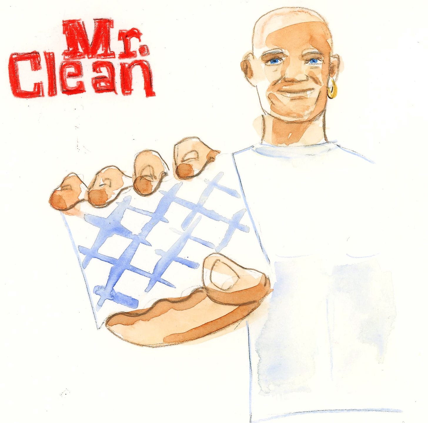
the art to look nice and clean and professional, which means that I try very hard not to turn in anything that has paint blobs and ink spots and stray pencil marks around the art. (Notice the grubby dots and smudges around the illustration above, for instance)
That’s where Magic Eraser comes in.
Turns out that illustrators use these ordinary household cleaning sponges to lift marks and stains off their artwork. If an ordinary eraser doesn’t work, a Magic Eraser sponge just might do the trick. Test this first on scrap paper, but here’s how it works: Dip a corner of it into the tiniest bit of water, and blot or wipe very gently. I’ve found that spots and marks (I’m talking about watercolor, colored pencil, and regular pencil marks) come out quite easily.
Your mileage may vary, but if you have one of these around the house anyway, give it a try.
Substack has an app, and the app has a chat function.
Are you looking for a new time-waster app for your phone? Yeah I know, me neither. But the Substack app is pretty nice. If you subscribe to a few newsletters, and they tend to get lost in your inbox, it’s kind of nice to scroll through and catch up on your reading in the app. (You can even add things not published on Substack, if they have an RSS feed. Here’s how.)
And now they’ve added a chat function, a more casual way to talk about…well, anything. You can always post comments for me or your fellow readers to the bottom of any individual newsletter (see link at the bottom of this newsletter), but now there’s this other thing, a general chat among all of us.
Is this of any interest? Would it be of any use? I don’t know. I turned it on and started a chat thread just in case. Here’s how to find it:
Download the app by clicking this link or the button below. Chat is only on iOS for now, but chat is coming to the Android app soon.
Open the app and tap the Chat icon. It looks like two bubbles in the bottom bar, and you’ll see a row for my chat inside.
That’s it! Jump into my thread to say hi, and if you have any issues, check out Substack’s FAQ.
What Are You Reading?
I’m always happy to read a Liane Moriarty novel. They pass the time, they’re sort of interesting, and they make great TV adaptations. (Big Little Lies was an extraordinary show and a pretty good book.) This was not her best book, but if you like a Liane Moriarty novel, you’ll like this one.
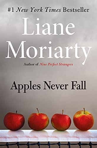
Now I must rant for a minute about this cover. Liane Moriarty is a global bestselling author. Her publisher undoubtedly spends a fortune launching her books. They can afford to hire not one, but several of the world’s best cover designers to come up with brilliant, eye-catching cover ideas. Instead, she got this. For a novel titled Apples Never Fall (not a great title, but there it is), about four kids in a tennis family, she got…four apples improbably perched atop a tennis net.
Really?
The job of a cover is not to literally illustrate a book’s plot or any particular scene in a book. The job of a cover is to evoke an emotion, a mood, a vibe that makes the reader think, “oh yes, I want to live in this world for a little while.”
This is the least evocative, least world-building, most emotionless cover I’ve ever seen.
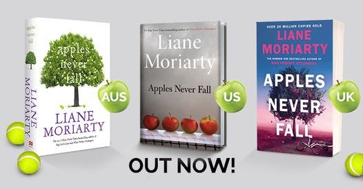
The UK and Australian covers don’t do much better—they just slapped a photo of an apple tree on the cover and called it done. Certainly a better title would’ve helped: you’d think someone would’ve said, “The problem with this title is we’re pretty much doomed to having to put an apple on the cover, and I don’t know how we make that a great cover for this kind of book.”
Oh well. Obviously the book is doing fine. I’m just irrationally irritated by this epic cover fail. If you’ve read this far, would you like to hear me rant about another, much more worthy book with an epic cover fail next month? Tell me in the comments.
The Stuff at the End
Come find me on Instagram
Order signed copies of some of my books from my husband’s bookstore
Order my books and many books I love at Bookshop.org, which supports independent bookstores
Take one of my online writing or art classes here
Sometimes I post paintings for sale! Right here



Love the cover rants!
I'm also a Moriarty fan and had no idea she had a book out, mostly because (I think) it got left off all the best-of lists because of this joke of a cover. I am nowhere near the bestselling status of Moriarty, and yet, if my publisher showed my agent this, she would...let's just say that cider would be made out of those apples. LEAD WITH TENNIS! There are so many incredible phrases they could have taken from tennis (Break point, duh??). Maybe they're trying to sell a Yankee Candle at the same time, I don't know, but I guess I'll have to read this on kindle so I don't have to stare at this cover. And yes, I would love more cover rants!