


Art Lesson #3: A Beautifully Balanced Still Life
(and yes, it's another cocktail!)

Still Life: Color and Composition
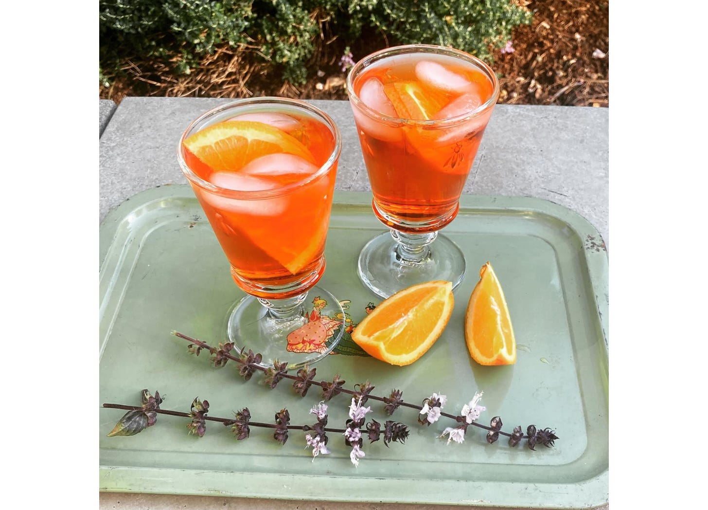
My friend Debra Prinzing posted this photo and I knew immediately that I wanted to paint it. I know this is our second week in a row to do cocktails, but we’ll take a break from drinking after this, I promise!
I love it as a still life, because it consists of three very different elements—the larger drinking glasses, the smaller orange slices, and the long, spiky flowers. And in a still life, it matters what the objects are sitting on. That tray is a good background—it has a particular shape, the color serves a purpose, and it helps to tell a little story (drinks in the garden!).
I also loved the color scheme, which uses the three secondary colors. So if you think of the primaries—some version of red, blue, and yellow—these are the secondaries. Orange, green, and purple.
Keep reading with a 7-day free trial
Subscribe to It's Good to Be Here to keep reading this post and get 7 days of free access to the full post archives.